Hello friends,
It's been awhile since we did this bathroom makeover and I wanted to share with
you how easy it is to change a few items without breaking the bank!!
So let's start here at the finish. How often do you say come on in especially a bathroom.
We went from this
To this
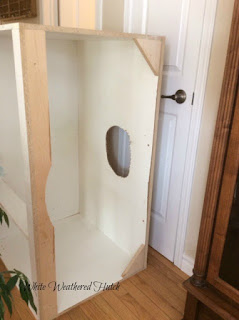
You can see in this post of March how Mr. WWH made and installed the frame.
I knew then that I needed a bathroom reno! That I started to collect paint chips and pictures of vanities and faucets
I wanted it to be a white vanity with a gray and white marble top.
As well to change up the paint on the walls.
I loved my light fixtures so I knew they would stay.
Our tub and toilet are in the light gray so I knew they would stay. Don't change it
if it's not broken.......
Definitely the shower curtain to white.
The floors stayed the same.
So the hunt began.
A white vanity (Lowe's)
A Marble top, bonus with a sink (Lowe's)
Moen taps that are brushed nickel so the water spots don't show
Paint Benjamin Moore Stonigton Gray HC-170
The breakdown of costs
Labour 0
White Trim paint 0 already had
Stonigton Gray Paint 1 gallon $35. Home Hardware
Lowe's Vanity
Marble vanity top with sink
Moen brushed nickel faucets
On sale $1,000.
New Trim around the doors and
floor. $100.00
Accessories
Homesense
Rug $30.
Soap and hand cream glass dispensers $40.00
Our bathroom before
Builders vanity, sink and mirror. Paint Benjamin Moore Muslin.
and Now The Wow!
The vanity is taken apart and out it comes.
No turning back now... This is the vanity.
As you walk in the vanity is on the right with a laundry closet right beside it.
At the end of room and round a corner is the toilet.
Love the artwork!
Love my rug and you can see how the wall paint stands out!
All new trim as well.
There was one small glitch .....the vanity measured 48 inches and the marble top 49 inches.
The opening for the vanity was 48 inches. You see when the bathroom was built the wall for the laundry closet went up after the vanity was in place.
Mr. WWH was not about to cut the marble so he cut the wall and slid it in on its side.
See there to the left where the white grout mark is.
You would never know unless I pointed it out.
Across from the vanity is the tub area and a nice feature Mr. WWH put in, a rounded shower rod.
Makes the tub enclosure much larger. New white Shower Curtain.
The door that you see in the mirror leads to the Master bedroom.
It doesn't take much to make a Big impact with just a few changes!
Thanks for following along!
A Stroll Thru Life
Savvy Southern Style
Share Your Style


Gorgeous. Love the new color and that vanity is perfect.
ReplyDeleteLooks good , It is always nice to have all new fresh paint and decor done . Thanks for sharing , Have a good day !
ReplyDeleteI love the new look! I especially like your square shaped sink. When we looked at new houses earlier this year, I noticed that was the trend. I love that look!
ReplyDeleteThat is a wonderful makeover and totally updates your bathroom, Linda. I really like the counter and sink and as Kelly mentioned, the square sink is a higher end look for sure. The other pieces and colours you chose work really well too. I hope I can get a smaller version of a counter/sink like that for our master bath one day.
ReplyDeleteGood job! Looks so nice!
ReplyDeleteIt looks wonderful! Love the paint colour and the vanity is perfect for that space. We had one of those rounded shower rods and you're so right, it makes the shower feel so much bigger. When we renovated, we tossed it in lieu of a glass shower door (which I also love).
ReplyDeleteNice to see you back in blogland - take care!!
Beautiful makeover Linda! I love the new vanity and the squared sink, sleek faucet, and nice grey paint. The white shower curtain brightens the space and makes it look larger too. You did a great job.
ReplyDelete